UX 404: Don't Make Me Think

‘’Clean up storage space’’, pleaded my phone as I was about to install another app that I would probably end up not using.
‘’Fine’’, I retorted and scrolled through the apps that were using a lot of precious space. One of the biggest offenders was Outlook.
It ate up more than 1.5 GB of my storage space and I decided to say goodbye to it in one swift move rather than just deleting the unnecessary data. This was easier and faster. After all, it would just take me entering details of my accounts once I download it again; no biggie.
Soon enough, I downloaded Outlook’s app again and it was set up in a matter of minutes.
Or so I thought.
The next day, my inbox was full of emails coming from all the random subscriptions I have accumulated over the years. I would not take a look at the majority of them and, instead of unsubscribing, I keep on receiving and deleting them, in the hope that there will eventually be something that will catch my interest.
I started by deleting a few.
Then a few more.
At some point, I noticed that there was something odd going on.
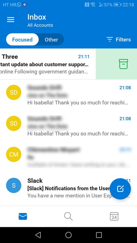
Why was I receiving the notification that it was ‘’archived’’?
I was trying to delete them, not archive them.

Instead of deleting spam, I ended up archiving it. It could be a funny read in a couple of years though.
A closer look showed me that, by swiping left, Outlook would archive my emails.
Contrary to what I would describe as intuitive, a tiny box-like icon would appear every time I swiped left.
Did I think about it? No. Should I have thought about it? Well, no.
The swipe left option became popular in dating apps, with the likes of Tinder, Bumble and Hinge rising. If you swipe left, you are not interested in connecting with your potential date. And so you swipe left, and left, and more to the left, until you finally spot someone that catches your interest.
Since we as users are used to this ‘’swipe left to delete’’ motion, I find it startling that Outlook is using the same motion, but for a different purpose.
I was curious to see what happens if I swipe right.
Would that delete my unwanted email?

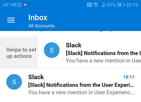
Swiping right opened up a whole new world of customized actions
Turns out, I was wrong again.
Swiping right just opened up ‘Swipe options’.

If you are the kind of person eager to customize the options on your apps, that is your solution to the problem. I immediately set them up so that every swipe would do exactly what I want it to do.
All I am left wondering was why this was necessary in the first place. Why did Outlook decide to go against the habitual left swiping to create an action that goes against wide-known and well-used apps?
Surely not everyone uses dating apps, but I have seen the ‘swipe left to delete’ concept being used in other apps that could not care less if you are single and ready to mingle.
[embed]https://gfycat.com/filthyheavybass[/embed][embed]https://gfycat.com/neatnervousbronco[/embed]
Logic tells me that if I see a hamburger menu, I should know what to expect from it. If there is an ‘’x’’ in an app or piece of software, I should know what the consequences of clicking it are.
This is the same scenario, but only with an actual hand gesture attached to it.
So if I swipe left, please, don’t let me think twice. Just bloody delete it.


