Why Do We (Dis)trust Type

This story starts with a tiny T-shaped device called the IUD. As my method of contraception was beginning to feel less and less safe, I decided it was time to update it. So I booked an appointment with a sexual health clinic to get my IUD fitted.
I’d never had an IUD before and felt a bit stressed about the procedure. Some say it was the most painful moment they’ve ever experienced, while others would go back to their regular workout routine the next day.
I wanted to know how the process of insertion is supposed to go and what I could do to physically and mentally prepare. That, of course, led me to Google.
Although everyone’s experience is different, visiting forums is not the place to seek reassurance that things will go well. There is usually conflicting messaging, from unproved sources, that can make your anxiety level skyrocket.
That is why I was trying to find trustworthy medical sources and landed on guidelines on the official NHS website.
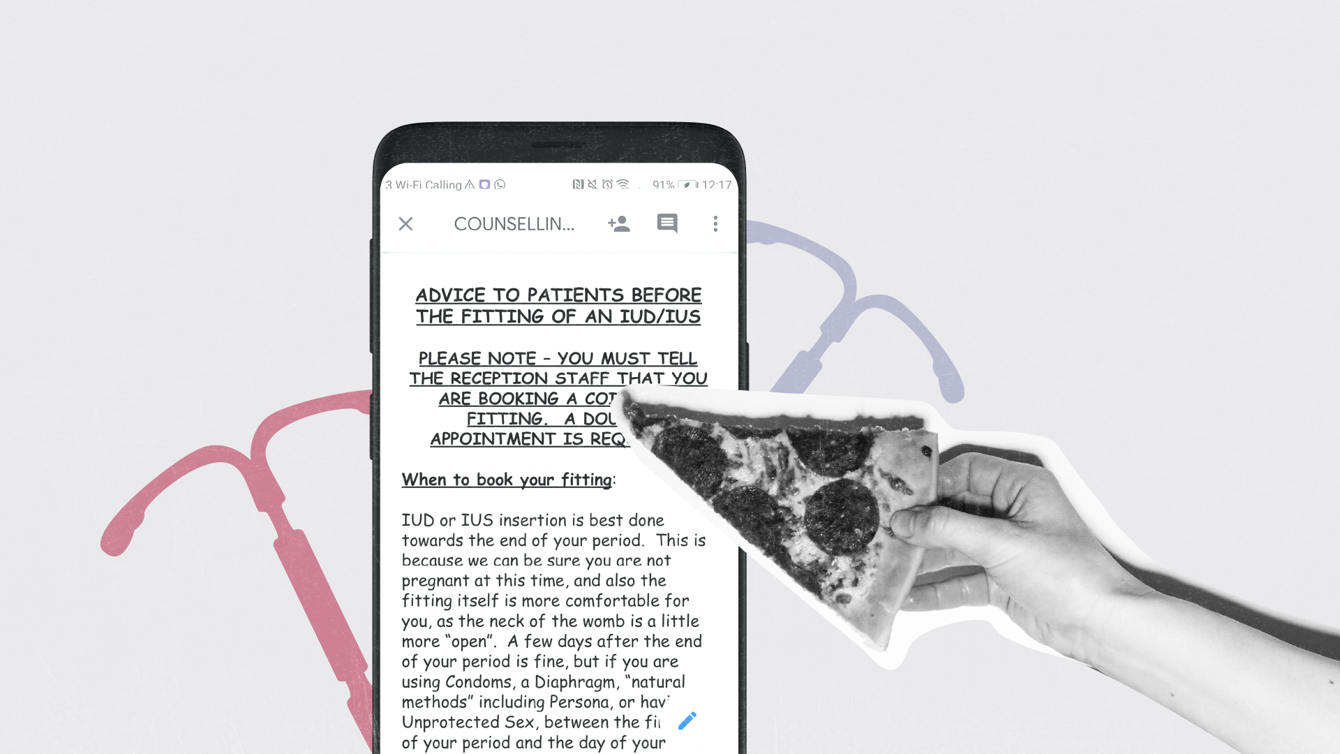
I trusted these guidelines on the National Health Service would provide me with accurate information. I downloaded the PDF and, once opened up, my eyes immediately fell on the text written in Comic Sans.
In that fraction of a second, I had a thought lingering in my mind: ‘’Don’t look at how this is written, but what is written.’’
But the rounded, overly-friendly shapes of Comic Sans letters stayed in my mind, making the information that was written much less believable.
I could not believe any medical instructions written in this font.
One reason why I don’t trust forums that have looked the same way ever since the ‘’dawn of the internet’’ in the early 2000s is that they look, well, dodgy.
Not only because anyone can write their opinion, but also because their interface looks unkept, following the design trends that were new when they were first made. Now they are stuck in time, buried under emerging trends that we got used to seeing and trusting.
But let’s go back to that Comic Sans in the medical guidelines.
Why Fonts Matter
We have been trained to see the same typefaces in documents, exams and school books. Even books and movies, if we look at them more closely, have type that we associate to a specific genre.
‘’Epic’’ movies often adorn their titles with the font Trajan that was derived from the lettering that was on Trajan’s column (a column that celebrates the Roman emperor Trajan).
Fantasy books covers often feature calligraphy-inspired type that we associate with writing manuscripts in the past. Romance novels can be immediately spotted by the ornamental serifs on the cover that we might associate with diary entries or writing love letters.
How We Sort Information
All objects that we encounter in life shape how we perceive them and lead us to place them into categories. That is called categorical thinking - we, unconsciously, put information in clusters.
That is how we can differentiate between a stack of books versus a stack of DVDs. And that is how we create a mental category for what we’ve come to know as a romance novel, versus a horror story.
This explains why Comic Sans on that IUD guidelines was out of place.
When I think of Comic Sans, even without the stigma it carries on the internet, I associate it with what I have encountered in life so far, like:
Sticky menus in restaurants on islands
Small corner shops that sell everything from detergent and fruit, to SIM cards
Local kebab places
My own ‘’magazine’’ that I created at the age of 10, featuring my friends and cats on the covers
Not to even mention all the hatred the font has amassed over the years in design circles - so far as to have had a dedicated website to ban it.

What’s Your Type?
In her book Why Fonts Matter, Sarah Hyndman writes about fonts as if they were people with distinctive personalities.
Who do we trust? Who makes us feel safe, who gives us confidence - and who doesn’t?
Looking at the NHS guidelines, I couldn’t take them seriously.
While reading about the process of an IUD fitting, all I could see was the neon lights of the kebab signs in front of my eyes and menus of cheapish restaurants with misspelled names of pizzas.
Comic Sans made me feel like my health was a joke. At that point, I felt stressed and anxious. What I needed was reassurance and guidance, someone to take my hand and tell me ‘’this is what you can expect’’ and ‘’this is what usually happens’’.
I needed information conveyed in a type that will make me trust it, even just by looking at it. I needed to read the guidance without making me question their trustworthiness and authenticity.
What we perceive as the default has a very profound effect on us. Whether it is the colours we associate with brands, websites where we shop or, as in this case, the (un)suitability of type.


